You know how some kids play with their presents, and some kids play with the packages?
I guess I'm a packages sort of kid, for tonight anyway.
The backstory here is that I recently noticed that the printing on product packaging is a lot more sophisticated than it used to be.
It used to be that if I saw a photograph on a mass-produced piece of paper, it was a very safe bet that when I looked close with a magnifying glass I would see a classic CMYK screened halftone, and nothing else.
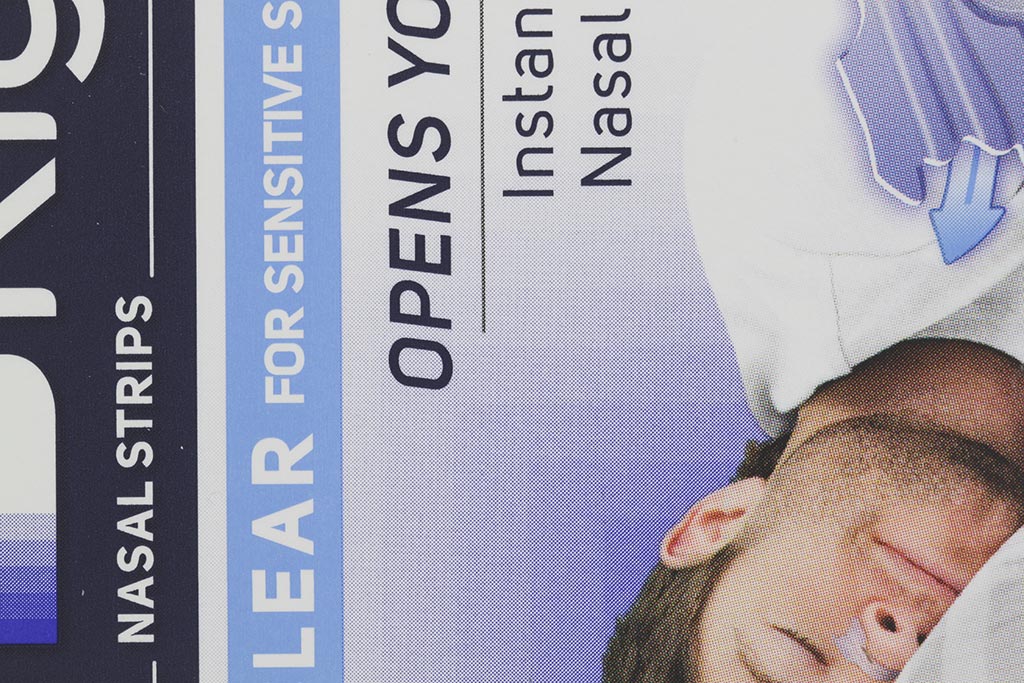
Turns out, that's no longer the case. What I'm seeing now is typically 6 color printing, sometimes more, with a mix of halftoned CMYK, hard-edged vector mode CMYK, and a couple of other custom colors, which may themselves be printed in some combination of vector mode and halftones.
This hurt my head for a while, because I was having trouble imagining what sort of process was producing the printing plates. Finally it occurred to me that with high resolution photolithography and digital layout programs, the plates can easily be made with any pattern at all on them. The graphics guys can mix halftone screens with vector graphics at will, on the same plate, and in fact the halftone screens don't even have to be regular grids any more. I'm embarrassed by how long it took me to figure this out, but at least my head doesn't hurt any more.
Here are some examples.
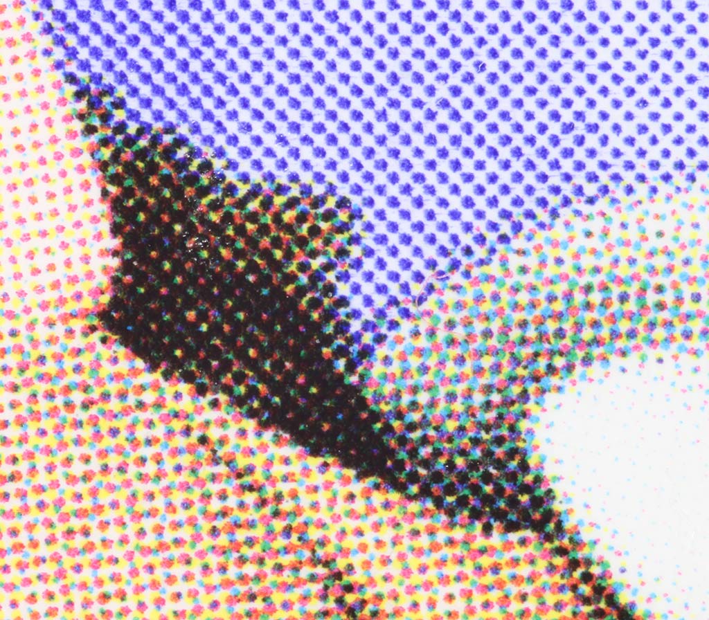
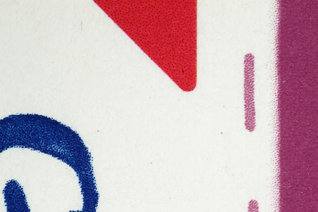
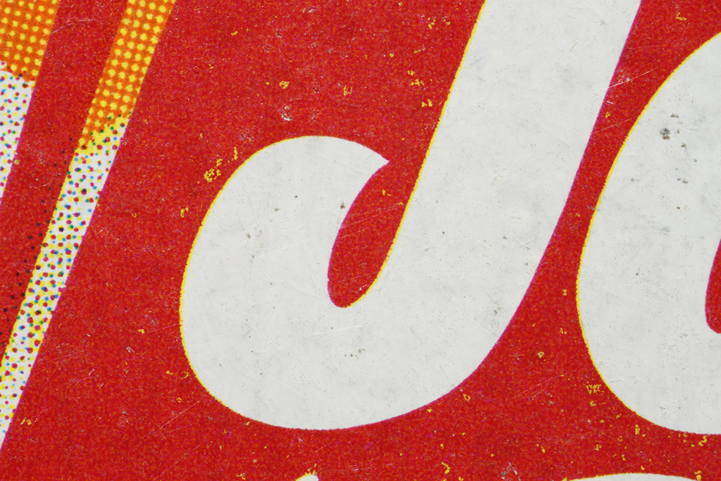
To begin, the label on a package of popcorn: all halftoned with a regular grid, except for the logo which is vector mode.
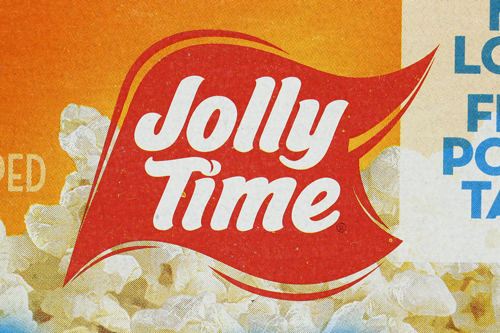
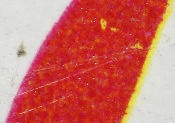
I wondered if the logo was done with red ink, but no, on closer inspection it turns out to be just magenta and yellow from the CMYK inks, laid down in as solid layers with a smooth outline. They're not perfectly registered, so a closeup shows magenta and yellow halos on a red region, and in places there are islands of yellow where there are holes in the magenta.
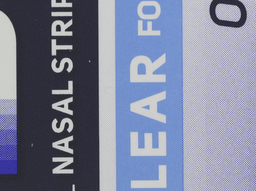
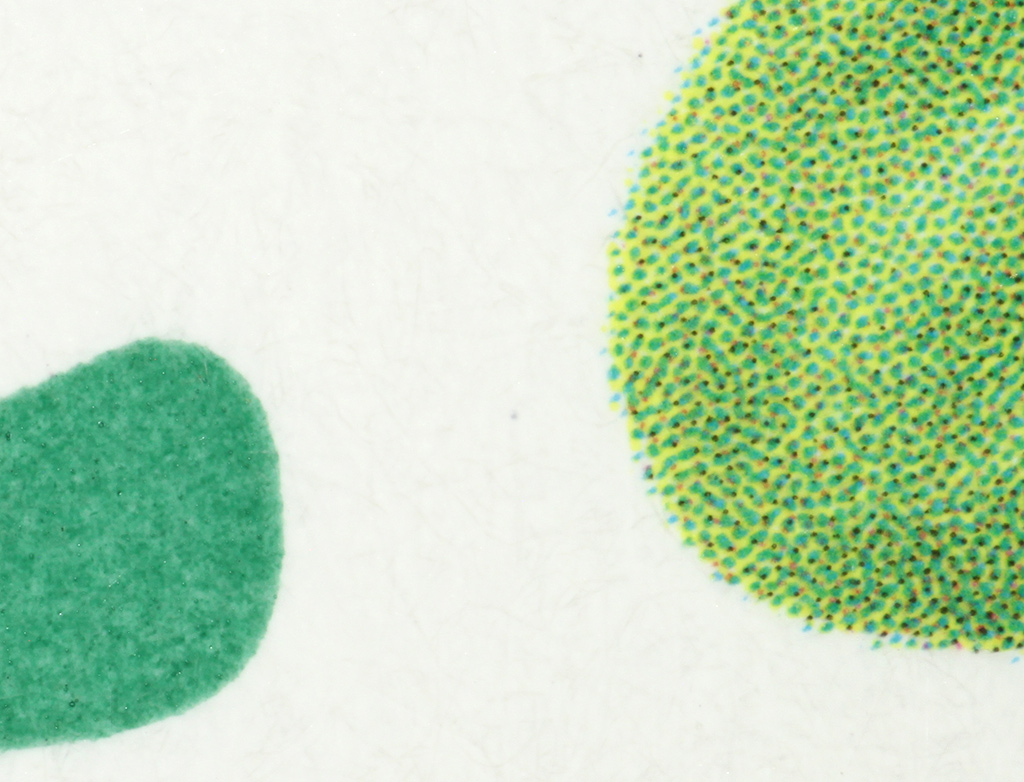
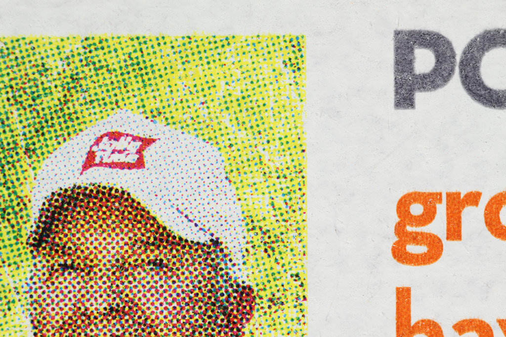
However, elsewhere on the package other colors are used. For this package, the standard CMYK set is augmented with tan and gray.
The tan and gray are used for lettering. Here is a section of the package showing tan and gray text in vector mode, next to a photograph that is mostly screened, except for the product logo on the cap, which has obviously been pasted in as a vector graphic. What fun!
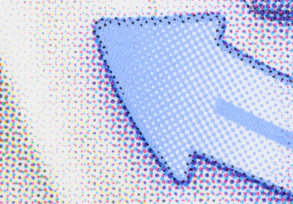
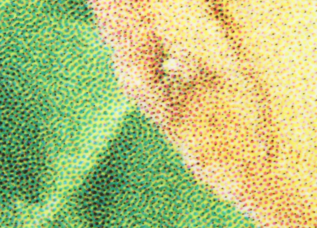
At least all of the above are regular grid screens. That seems to be the most common approach, but it's not universal.
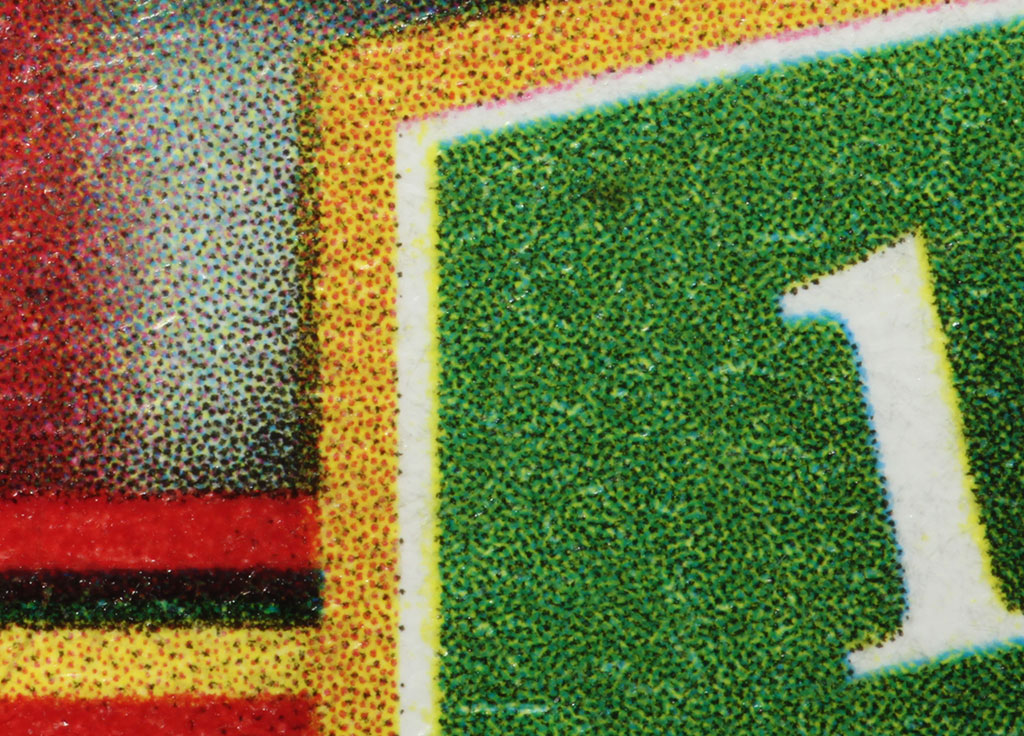
Here for example is a bit of the label from a can of Hunts tomato paste. This label is just CMYK, as far as I can see, or maybe there's a dark yellow added in as a process color, but in any case the halftone screen is randomly positioned dots. Very clever!
I hope you find this interesting, or at least colorful.
Merry Christmas!
--Rik
6-color printing, halftone & vector, on product packages
Moderators: rjlittlefield, ChrisR, Chris S., Pau
- rjlittlefield
- Site Admin
- Posts: 23626
- Joined: Tue Aug 01, 2006 8:34 am
- Location: Richland, Washington State, USA
- Contact:
Hi Rik, interesting, ... it has always fascinated me as the mixture of different colors makes us see another different one, ... our RGB sensor, and our neural processing, in front of the real world.
The gentlemen of the printing press have been applying this concept for years in order to obtain the best results with the minimum resources ... in a similar way to what our beloved camera manufacturers do.
This reminds me of the main sensors for digital cameras, Foveon, X-Trans and Bayer ... and the problems involved in the widely accepted Bayer ... (X-Trans does not stop being a Bayer, .. but with a certain amount of randomness)
In short, the digital world, and the market economy, pervading everything ...
Best regards.
Ramón Dolz
Rik,
Interesting.
Think the folks that make the high end photo ink-jet printers also use 6, 8 and even more colors (inks). I have an old Canon Pima-Pro 100 (these had rebates that made the total cost $50!) that uses 8 different inks.
Best,
Interesting.
Think the folks that make the high end photo ink-jet printers also use 6, 8 and even more colors (inks). I have an old Canon Pima-Pro 100 (these had rebates that made the total cost $50!) that uses 8 different inks.
Best,
Research is like a treasure hunt, you don't know where to look or what you'll find!
~Mike
~Mike
- rjlittlefield
- Site Admin
- Posts: 23626
- Joined: Tue Aug 01, 2006 8:34 am
- Location: Richland, Washington State, USA
- Contact:
I know at least three reasons for using more than the basic CMYK colors:mawyatt wrote:Think the folks that make the high end photo ink-jet printers also use 6, 8 and even more colors (inks). I have an old Canon Pima-Pro 100 (these had rebates that made the total cost $50!) that uses 8 different inks.
- Expanded gamut.
- Improved gradation within gamut.
- Improved repeatability for certain special colors.
For improving gradation within gamut, it's quite common now for photo printers to include "light magenta" and "light cyan" as ink colors, to work around the limitation that it's challenging to reliably spit small amounts of ink to produce light colors. Your Pixma-Pro 100 did that also for black, by including gray and light gray.
Making certain colors highly repeatable is done with "spot" colors that are mixed so that a solid blob of ink is exactly the color you want. Great for "brand" colors. Of course there's nothing that prevents spot colors from being halftoned if you want to produce gradients.
An interesting hybrid scheme is what's called "simulated process" printing, or "spot process", where specially selected spot colors are also mixed with other colors in a halftone scheme that does expanded gamut.
Of course now I'm temporarily addicted to hauling out my pocket magnifier and looking close at every package that passes through my hands.
Here's an interesting example that turned up yesterday. I count seven colors: CMYK plus a dark blue, light blue, and a sort of purplish blue, with both of the last two also incorporated via halftoning into gradient graphics alongside a CMYK photo image.
--Rik
- rjlittlefield
- Site Admin
- Posts: 23626
- Joined: Tue Aug 01, 2006 8:34 am
- Location: Richland, Washington State, USA
- Contact:
More variations on the general theme...
This one is 7 colors, CMYK plus three spot colors: dark blue, purple, and green.
The dark blue and purple spot colors are also half-toned in places. I don't see any halftones for the spot green, but surely that's just a quirk of the artist.
The halftones are all random dots.
--Rik
The red Nabisco logo appears to be solid yellow+magenta, with a bit of black half-toned in. The blue and purple here are spot colors.