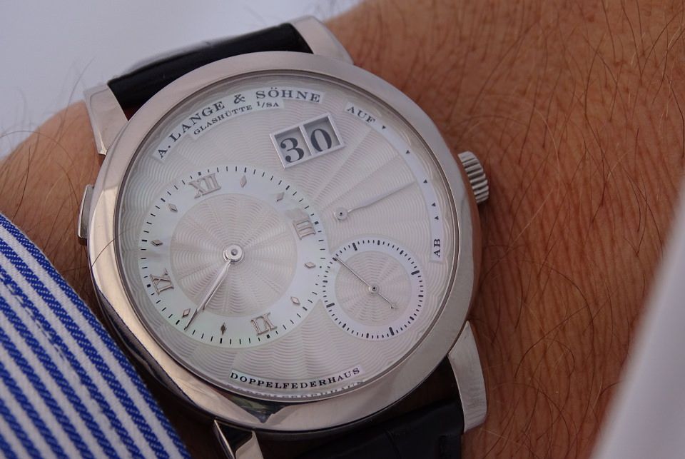
Please would you comment on a macro shot of my watch (Lange)

A forum to ask questions, post setups, and generally discuss anything having to do with photomacrography and photomicroscopy.

Moderators: rjlittlefield, ChrisR, Chris S., Pau

techniec
Posts: 3
Joined: Tue Apr 05, 2016 9:07 am

Please would you comment on a macro shot of my watch (Lange)

Post by techniec »

Dear all,

With reference to the topic matter, I would very much appreciate if you could provide me with some comments on my macro photography skills: please find below a macro shot that I took of my A. Lange & Sohne Lange 1:

Image

Have been posting on watch forums for quite some time now, so would greatly appreciate some (constructive) advice on how to improve my pictures.

Many thanks !

BR,


Pieter

ChrisR
Site Admin
Posts: 8671
Joined: Sat Mar 14, 2009 3:58 am
Location: Near London, UK

Post by ChrisR »

Hi Pieter, Welcome to the forum. I moved your post here rather than the Beginner's forum - it's better than that.

Which direction are you aiming, when you make an image? The manufacturer's pictures, as in the gallery here http://www.alange-soehne.com/en/timepie ... lery/cover
are "sexier", and doubtless processed very much to emphasize the attributes they want to sell.

You've got a lot working well here - reflections, exposure, focus fall-off, are well under control for example.
What would I do differently? I'd try to bring out the texture of the engine-turning on the face, make details like the text appear a little sharper (here?), and probably alter the lighting where the second hand is tonally very close to what's behind it.
That would mean harder lighting, with the risk of a glare on the crystal. Perhaps that would be OK, I don't know.

Are he hands in the best place? "Ten to two" always looks wrong now and the old conventions don't make stipulations for a Reserve de March, afaik.

I wonder, is the back as interesting as the front? If so, let's have it, Both Barrels!
Chris R

techniec
Posts: 3
Joined: Tue Apr 05, 2016 9:07 am

Post by techniec »

Many thanks for the suggestions, Chris !

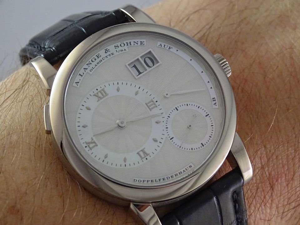
Here's another macro shot of the dial that I took a while back:

Image

Will try to make a nice shot of the transparent caseback, showing off the movement, during the weekend !

Cheers,


Pieter

rjlittlefield
Site Admin
Posts: 23597
Joined: Tue Aug 01, 2006 8:34 am
Location: Richland, Washington State, USA
Contact:

Post by rjlittlefield »

Pieter, welcome aboard!

I agree with all of ChrisR's comments, many of which are addressed by the second image that you've posted.

For myself, I find there's an additional issue in that I'm distracted by all the fine detail that is not part of the watch -- for example the weave and pattern of clothing, folds of skin, strands of hair, and so on.

In your first image, this effect is so strong that it requires conscious effort for me to pay attention to the watch. The second image works better for me, I think because the watch face is bolder, but even so I have the feeling there are a lot of distracting aspects. Showing off the watch against a less distracting background would work better for me.

--Rik

g4lab
Posts: 1437
Joined: Fri May 23, 2008 11:07 am

Post by g4lab »

I agree with Rik. I think the disembodied wrist is distracting. You need to find a watch case/box holder to use as posing furniture. It will have the additional advantage of not moving the way a wrist attached to a live human does.

Also I feel that your image is not bright enough. Usually jewelry and watch images come across as higher key.

Charles Krebs
Posts: 5865
Joined: Tue Aug 01, 2006 8:02 pm
Location: Issaquah, WA USA
Contact:

Post by Charles Krebs »

Prefer the first composition... the second it too distracting. But the lighting could be improved to make the watch "stand out" as the subject of the picture.

The first one posted can actually be greatly improved with a few quick and basic "post-processing" adjustments.

If you would like I could post a quick "edit".

ChrisR
Site Admin
Posts: 8671
Joined: Sat Mar 14, 2009 3:58 am
Location: Near London, UK

Post by ChrisR »

I'm in a local "Photographic club" which, like many others, has monthly competitions. Some people make photographs which they think will do well, because the judges all follow a similar line.
Others know what the judges will say but ignore it because they're not interested in what makes a "good" competition photograph. Those members enter pictures in the manner of a mini exhibition, for general discussion. Usually they're far more interesting, to me, if not as pretty.

Many of the photographs shown in this site would get nowhere in a club competition. It's quite amusing to see a judge floundering with a subject he doesn't recognise, taken a way he doesn't understand, (and probably couldn't achieve) but is obviously, competently done.

So, things which don't bother me, because I'm interested in the actual watch, but would stimulate a competition judge to a frenzied climax of didactic self-righteousness:
anything which:
is distracting,
not contributing to the image,
should have been "corrected",
is not in the "correct" position for classical composition (the thirds, dynamic angles, yadda yadda)
hasn't been brought out as well as it could have been
oh yeah, exposure, levels sharpening,
though they're often oblivious to most technicalities

then, they always want something to get their artistically sensitive credentials displayed, some more eloquently than others:
is it just a hugely accurate picture of a watch ( they usually ignore that one)
Does it have style?
Is there some flair, sexiness, underlying mystique, message or metaphor??
(I once entered a photograph of a blurred blob and called it "Je ne sais quoi" and it did well... :roll: )
Look again at the "gallery" pictures of the manufacturer's site. They probably use photographic club judges.

Now that I have done a fairly thorough job of discrediting the standards which are oh-so-likely to get applied, and you hopefully feel ready to ignore me, here goes

You'd get hammered, based on the reasons above, for
the white triangle lower left - what's that?
the white at upper left - white draws the eye, don't put it on the edge
the hair across the bezel
the strong blue color
the awkward angle of the wrist
there's an odd blurred edge to the strap at the top
the unfortunate reflection in the bezel
the winder looks grubby
dominating textures as mentioned - hairs, cotton, highlights on hairs
the face isn't sharp - at least it doesn't LOOK sharp - it's a machine so it should
there's ONE white hair, which draws attention to a couple of smaller ones, so the owner is getting older - is that what you wanted to say? If not then don't. Remove it.
Overlapping hands - not the most photogenic - change it

Then - is it sexy enough?
No.
Why? Lighting is rather cold, flat, could be more interesting.
Is it saying anything? No, no message to me.

I'm personally not capable of suggesting how to add style. I believe sex was something people did in the 80's?? Usually it's funny lighting and perspective.

There is at least one interesting technical challenge - the "crystal" or glass, is diffusing the light, and softening the image.
Therefore the appealing details underneath, are kinda hazier than would be nice. I'd expect the date is good and contrasty?
This is breaking our own rules in posting even a partial copy of the original image. I'll be happy to remove it if necessary, just send a pm and I'll edit and delete the file.
Here's the histogram for the face:
Image
It's all grey and grey.

It does respond to post processing, which may be a necessary option. "Smart Sharpen" is better than Unsharp mask, for avoiding telltale white edges, if you use Highlight Fade, therein. In another trangression of our rules, I've permitted myself a trial and left the result of a quick few clicks, Here. I desaturated the face quite a lot, because it took on a strange pinky hue. one disturbing thing which has become more noticeable, is apparent damage to the face, where some paint is missing and it seems to be bent. I suspect that's an illusion, I don't know.
Last edited by ChrisR on Sat Apr 09, 2016 10:22 am, edited 1 time in total.
Chris R

techniec
Posts: 3
Joined: Tue Apr 05, 2016 9:07 am

re: macro shots

Post by techniec »

Hi,

Thanks for your kind replies ! Would very much appreciate if you could touch up both pictures, as I intend to post them on various watch forums in the course of this weekend ! And will upload a shot of the caseback onto this forum, too !

Cheers,


Pieter

ChrisR
Site Admin
Posts: 8671
Joined: Sat Mar 14, 2009 3:58 am
Location: Near London, UK

Post by ChrisR »

With hindsight I should have moved this topic from its original place to the Technical Discussion section of the forum, and shall do so soon unless there's objection.
Chris R

Charles Krebs
Posts: 5865
Joined: Tue Aug 01, 2006 8:02 pm
Location: Issaquah, WA USA
Contact:

Post by Charles Krebs »

Pieter,

Just some quick "retouching" on the first image posted to make the watch face more clear, and to allow it to "stand out" better from the background.

Image

lothman
Posts: 965
Joined: Sat Feb 14, 2009 7:00 am
Location: Stuttgart/Germany

Post by lothman »

I would like to see much more of the hand/arm or when concentrating on the watch no arm, especially no hair.

And on the Lange 1 I would like to see a central second instead of second on the 5 - for me that looks like somebody forget to place the second dial.

On the other hand I like their Saxonia, clear lines.

Post Reply Previous topicNext topic