Why does my rainbow look different from yours?
Moderators: rjlittlefield, ChrisR, Chris S., Pau
- rjlittlefield
- Site Admin
- Posts: 23608
- Joined: Tue Aug 01, 2006 8:34 am
- Location: Richland, Washington State, USA
- Contact:
Why does my rainbow look different from yours?
If you split white light by wavelength, you get a rainbow. If you take a picture of the result, you get, well, a picture of a rainbow.
But if you take a picture of the same rainbow with two different cameras, you may also get two different results.
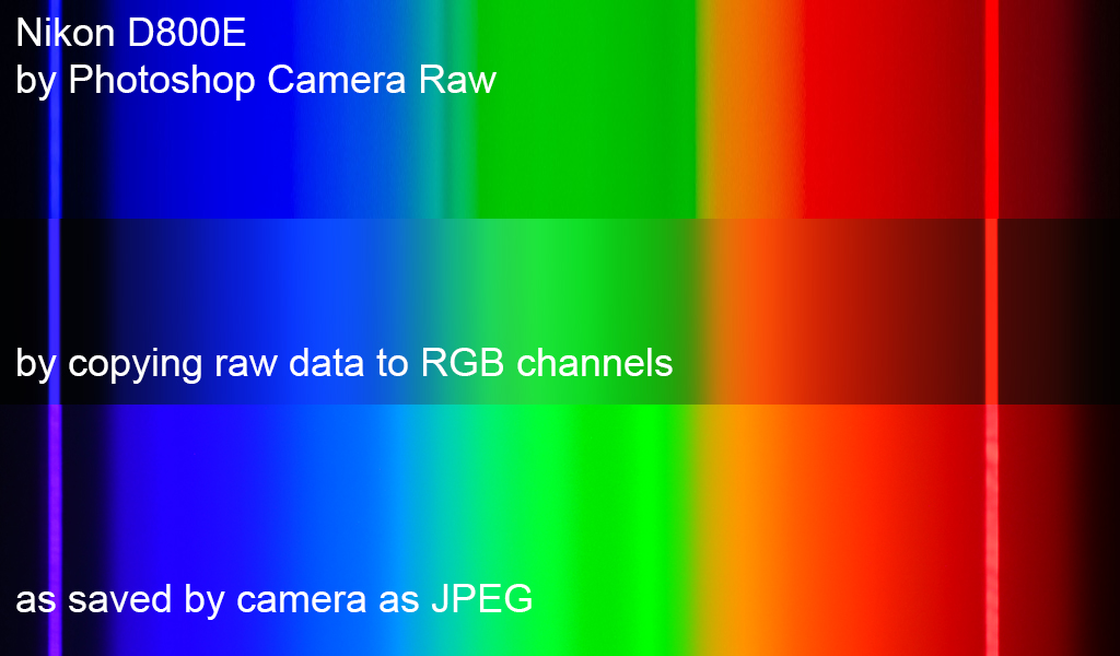
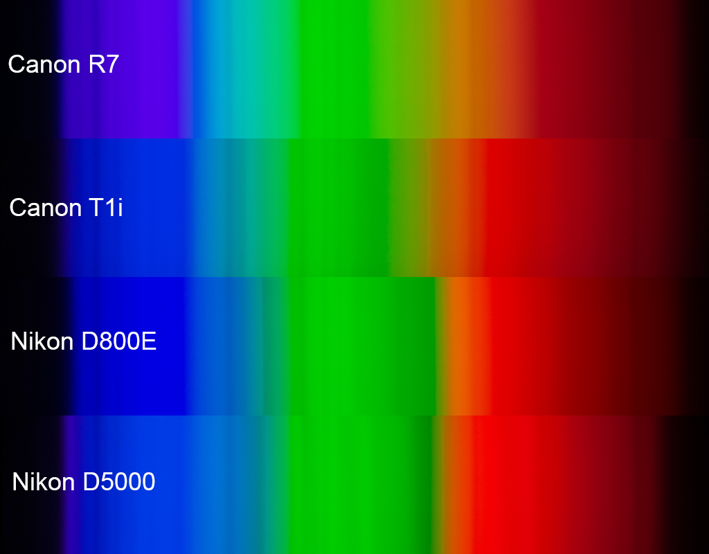
The diagram above illustrates this effect for two specific cameras.
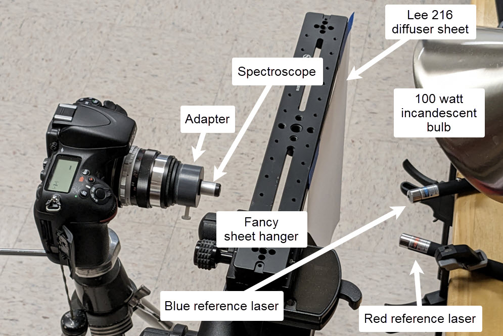
Here's the setup for shooting:
Very quickly, what you're looking at in the diagram at top are plots of the raw sensor data, aligned with RGB spectra as rendered by Photoshop Camera Raw using Tungsten 2850K with no other adjustments except exposure tweaking to match brightness.
Getting to this point was a bit of a journey. It started when I became intrigued by Lou Jost's report on using Fraunhofer lines as calibration points for a small spectroscope. So I bought a similar spectroscope and made an adapter that would let me use it with whatever camera I had handy.
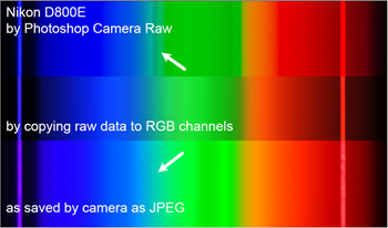
Of course the first thing I did was to point a camera at the sky and snap some pictures. The pictures looked oddly different from what I expected. So I pointed another camera at the sky, snapped some more pictures, and compared the results. With the cheap spectroscope, the Fraunhofer lines are not crystal clear, and in fact the pictures looked so much different from each other that I was not sure I was getting the Fraunhofer lines matched up correctly. Here is that situation, looking at a white cloud and again rendering with Camera Raw:
I wanted something more definite for wavelength markers; lasers came to mind. For just a few dollars, Amazon sent me a set of three laser pointers, one each red, green, and blue, sold as cat toys! The red and blue ones worked great, so I repeated the exercise with a studio setup using incandescent lighting to get a nice smooth repeatable spectrum. From that, I got this:
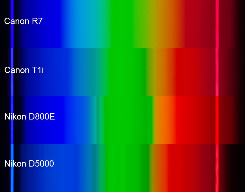
The differences in smoothness were striking, so I drilled down into the raw files using some purpose-built Python code. It turns out that by importing rawpy and cv2, the task of extracting raw values from the separate RGB photosites takes only a dozen lines of code. That got me hooked, and thus began a long chain of small improvements that ended up with ballpark 100 lines of code that read the raw files, automatically found the reference spikes, and used those to export normalized data and images to facilitate comparisons.
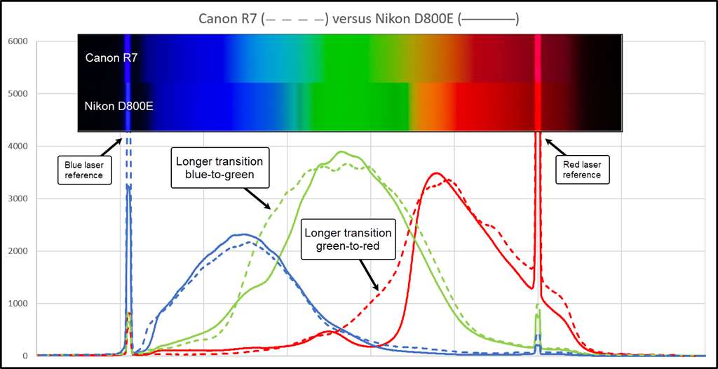
Based on these spectra, it is obvious that there are big differences in spectral sensitivity between various cameras. The transitions between blue/green and green/red are particularly striking. When my eye looks through the spectroscope, I see smooth transitions: red>orange>yellow>green>cyan>blue>indigo, all in smooth transition. But when I look at the images made by the cameras and software and displays, "lumpiness" seems to be the order of the day. OK, fine, I guess smooth must be difficult.
But then I had to wonder, if the spectral responses are lumpy, and spectral yellow seems especially dicey, then why is it that all these cameras can be talked into giving a decent picture of a bright yellow flower?
The answer to that question is suggested here:
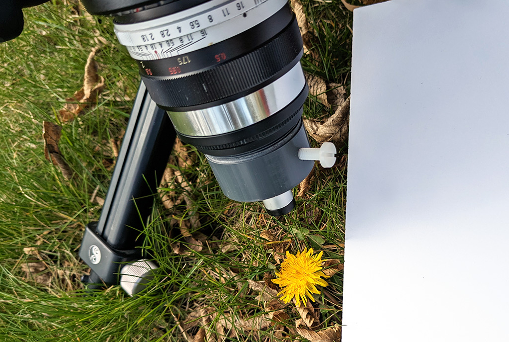
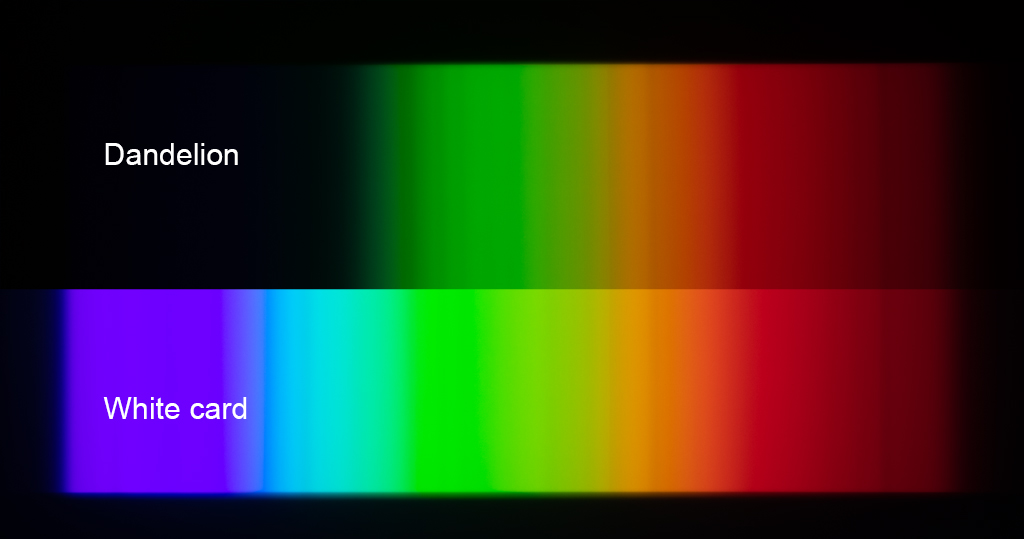
Comparing the spectra from the white card and the dandelion, it's now clear that spectral yellow plays hardly any role at all in the appearance of the dandelion. Instead, the yellow of the dandelion is achieved by simply removing all the blues, leaving the entire green+red part of the spectrum to be reflected at nearly full intensity. In retrospect, it's clear this has to be true for anything that is bright yellow in reflection. That's because if much more than the blues were removed, then the total energy would be significantly reduced and the color would no longer be "bright".
I think that's a good stopping point for now: cameras vary; spectra are more challenging than dandelions.
--Rik
- rjlittlefield
- Site Admin
- Posts: 23608
- Joined: Tue Aug 01, 2006 8:34 am
- Location: Richland, Washington State, USA
- Contact:
Re: Why does my rainbow look different from yours?
References:
- Lasers that appear identical to mine are discussed at http://www.kerrywong.com/2015/10/23/the ... -pointers/ .
- Human eye spectral response curves are shown at https://en.wikipedia.org/wiki/Cone_cell . Note that these are normalized; my curves are not.
Re: Why does my rainbow look different from yours?
Add to that the differences in UV/IR filters cutting off certain areas earlier or polluting others and then the camera profile differences in various RAW converters, differences under various light sources, how subjects react unter different lights, printing profiles, paper colour and the light during presentation... oof.
- blekenbleu
- Posts: 146
- Joined: Sat May 10, 2008 5:37 pm
- Location: U.S.
- Contact:
Re: Why does my rainbow look different from yours?
I have not worked in the field for over a decade, when so-called color science was quite competitive.
Considered in that light (pun intended), why would one expect competitors to have identical solutions?
To start, there are some practical considerations.
Sony and Nikon raw files might evidence more similar spectral responses than either compared to Canon.
Back in the day, Fuji color science was more different than that of Canon and Nikon;
that was attributed in part to cultural preference, with Canon and Nikon appealing more to customers coming from Kodachrome.
Considered in that light (pun intended), why would one expect competitors to have identical solutions?
To start, there are some practical considerations.
- traditionally, CMOS image sensors were based on obsolete memory technology
- silicon is not ideal for light sensing
- semiconductor doping chemistry and physics varies among fabs and technology generations
- so-called camera RAW may not be truly raw; some color correction is built into hardware to obtain consistency within camera models and among cameras of a brand, even when sensors are sourced from different fabs.
Sony and Nikon raw files might evidence more similar spectral responses than either compared to Canon.
Back in the day, Fuji color science was more different than that of Canon and Nikon;
that was attributed in part to cultural preference, with Canon and Nikon appealing more to customers coming from Kodachrome.
Metaphot, Optiphot 1, 66; AO 10, 120, and EPIStar 2571
https://blekenbleu.github.io/microscope
Re: Why does my rainbow look different from yours?
Really interesting info Rik. I spent quite a lot of time understanding and generating camera profiles for accurate colour reproduction - back when I did product photography. Quite simple in principle, using a ColorChecker card and relevant (rather expensive) software, but a bit of a drudge because I needed different profiles for each lighting situation too (types of lamp). I wonder if generating custom profiles for each of the cameras would smooth out the differences in this case.
Re: Why does my rainbow look different from yours?
When I got into UV imaging I ended up making a device to allow me to measure spectral response of cameras between 280nm and 800nm. And yes there are indeed quite noticeable differences between different makers and different models from the same maker.
This is some recent work looking at a Fuji IS Pro camera - https://jmcscientificconsulting.com/pho ... nsitivity/
Jonathan Crowther
Re: Why does my rainbow look different from yours?
That's still somewhat true when you take a look at their colour profiles and how they favour certain skin tones or colour ranges.blekenbleu wrote: ↑Sun Apr 09, 2023 2:12 amBack in the day, Fuji color science was more different than that of Canon and Nikon;
that was attributed in part to cultural preference, with Canon and Nikon appealing more to customers coming from Kodachrome.
At least now we're able to create our own profiles to get closer to "reality" (or at least what we would consider to look 'real').
- blekenbleu
- Posts: 146
- Joined: Sat May 10, 2008 5:37 pm
- Location: U.S.
- Contact:
Re: Why does my rainbow look different from yours?
A surprising amount of that lack of smoothing arises from algorithms used for creating and applying those profiles.
Metaphot, Optiphot 1, 66; AO 10, 120, and EPIStar 2571
https://blekenbleu.github.io/microscope
Re: Why does my rainbow look different from yours?
I'm glad you are enjoying your spectroscope!
https://www.cloudynights.com/topic/8676 ... t-overlap/
Are you sure about that? You could put an arbitrarily high amount of energy in the spectral yellow band, with no red or green at all. It would look very bright yelllow. On the other hand, there are definitely limits in the ability of RGB devices to record or display yellow. A perfect RGB bayer filter with no color overlap between colors will not record any spectral yellow, though it would handle "dandelion yellow" very well.In retrospect, it's clear this has to be true for anything that is bright yellow in reflection. That's because if much more than the blues were removed, then the total energy would be significantly reduced and the color would no longer be "bright".
https://www.cloudynights.com/topic/8676 ... t-overlap/
- rjlittlefield
- Site Admin
- Posts: 23608
- Joined: Tue Aug 01, 2006 8:34 am
- Location: Richland, Washington State, USA
- Contact:
Re: Why does my rainbow look different from yours?
Yep, all of that's a mess, and it's all in addition to the very basic issues that I've highlighted in this thread. In this thread, I've taken care to keep everything the same except for the camera bodies and, for the RGB inserts whatever behavior of Photoshop is implicitly controlled by the choice of camera. For the graphs, of which I've shown only two so far, even Photoshop is removed from the processing because I've drilled clear down to the raw data.FotoChris wrote: ↑Sat Apr 08, 2023 5:15 pmAdd to that the differences in UV/IR filters cutting off certain areas earlier or polluting others and then the camera profile differences in various RAW converters, differences under various light sources, how subjects react unter different lights, printing profiles, paper colour and the light during presentation... oof.
I always twitch at that phrase, "accurate colour reproduction". Even ignoring reference illumination, viewing conditions, and gamut restrictions, there is still metamerism lurking in every collection of materials that might be placed in front of the camera. The only guarantee you really get with a ColorChecker is that the ColorChecker itself will be accurately reproduced, subject to those limitations mentioned earlier. But I guarantee that there are other materials that the camera would see as identical to the ColorChecker patches, but the human eye would see as different.Beatsy wrote: ↑Sun Apr 09, 2023 3:02 amI spent quite a lot of time understanding and generating camera profiles for accurate colour reproduction - back when I did product photography. Quite simple in principle, using a ColorChecker card and relevant (rather expensive) software, but a bit of a drudge because I needed different profiles for each lighting situation too (types of lamp).
I'm quite sure that by calibrating at enough points on the spectrum, you could create a custom profile that would do a great job of handling spectral colors on a black background. That's just a lookup table driven by the R:G:B ratios in the input. It would be no great trick to turn that D800E's raw data into a perfectly smooth spectrum like you'd see in a textbook.I wonder if generating custom profiles for each of the cameras would smooth out the differences in this case.
But then I have to wonder what that profile would do with ordinary subjects whose colors come from smooth spectra. For example in the D800E around spectral yellow, the profile that works great for a spectroscope will have to take rapid changes in the input R:G ratio, and turn those into more gradual changes in the output R:G ratio. What effect does this have on a smear of artist's paint between red and green?
My guess is that if the diffraction spectrum looks great, then the paint smear won't. But I haven't tried it. I will watch with interest while somebody who's good with color profiles tackles the problem.
I would be interested to hear more about this. In the current experiment, for the most part I see a close correspondence between lumpiness in the RGB images and rapid changes in the raw data. But indeed there are a few places where the converted RGB has features that I cannot see in the raw data. For example here is the D800E data for incandescent light, as rendered three ways:blekenbleu wrote: ↑Sun Apr 09, 2023 4:50 pmA surprising amount of that lack of smoothing arises from algorithms used for creating and applying those profiles.
In the Camera Raw conversion, the dark band in cyan is striking. Likewise for the variation in brightness across the green area in the three versions. I assume these must be profile issues, but they are new to me. What can you tell me, especially about that dark band in cyan?
Edited to add: that dark band in cyan appears also in Lightroom, but does not appear when the NEF is pulled into GIMP/Darktable.
To clarify, I was talking about the case where the spectral yellow thing would be illuminated by the same light as a gray or white reference next to it, similar to the situation with the dandelion. This strictly limits the energy available in the band. Certainly if you isolate the spectral yellow thing, and shine a very bright white light on just it, then it will look very bright yellow. This is an extreme version of the trick used in some art displays to make an item "pop" with intense colors. But take that item out of the bright light, and it looks dark.Lou Jost wrote: ↑Sun Apr 09, 2023 5:55 pmAre you sure about that? You could put an arbitrarily high amount of energy in the spectral yellow band, with no red or green at all. It would look very bright yelllow. On the other hand, there are definitely limits in the ability of RGB devices to record or display yellow. A perfect RGB bayer filter with no color overlap between colors will not record any spectral yellow, though it would handle "dandelion yellow" very well.In retrospect, it's clear this has to be true for anything that is bright yellow in reflection. That's because if much more than the blues were removed, then the total energy would be significantly reduced and the color would no longer be "bright".
--Rik
- blekenbleu
- Posts: 146
- Joined: Sat May 10, 2008 5:37 pm
- Location: U.S.
- Contact:
Re: Why does my rainbow look different from yours?
Absolutely; the spectral locus is two-dimensional, with only intensity and ratio of R:G:B varying, one of which always being zero.rjlittlefield wrote: ↑Sun Apr 09, 2023 10:47 pmI'm quite sure that by calibrating at enough points on the spectrum, you could create a custom profile that would do a great job of handling spectral colors on a black background.
That's just a lookup table driven by the R:G:B ratios in the input. It would be no great trick to turn that D800E's raw data into a perfectly smooth spectrum like you'd see in a textbook.
Other out-of-gamut colors, which by definition may be indistinguishable from spectral, are trickier...
To a first approximation, camera color filters are so-called box filters over spectra, with some overlap.But then I have to wonder what that profile would do with ordinary subjects whose colors come from smooth spectra. For example in the D800E around spectral yellow, the profile that works great for a spectroscope will have to take rapid changes in the input R:G ratio, and turn those into more gradual changes in the output R:G ratio. What effect does this have on a smear of artist's paint between red and green?
Yellow is relatively easy, thanks to high luminance values (good signal/noise) and substantial overlap between red and green filters, emulating human color vision.
I suppose that "diffraction spectrum" refers to iridescent colors?My guess is that if the diffraction spectrum looks great, then the paint smear won't. But I haven't tried it. I will watch with interest while somebody who's good with color profiles tackles the problem.
Software can be confounded by high spatial frequency color changes that alias with Bayer filtering.
Perhaps most modern cameras include sensor characterization data in their raw filesI would be interested to hear more about this.blekenbleu wrote: ↑Sun Apr 09, 2023 4:50 pmA surprising amount of that lack of smoothing arises from algorithms used for creating and applying those profiles.
and stay in contact with e.g. Adobe to ensure that it gets handled appropriately, but
a fair amount of so-called "color science" may be implemented in hardware not patented, AKA trade secrets.
ASIC designers resist floating point solutions and others involving significant data cache thrashing.
One specific example is color profile processing, a 3-dimensional interpolation process which can be implemented using tetrahedral interpolation.
Colors near a vector between any 2 points in a profile 3D array can vary abruptly when switching among tetrahedra sharing only 2 points.
Other cheats can can reduce fixed point arithmetic precision by spatial dithering, e.g. https://blekenbleu.github.io/ImageProcessing/sped.html
Color correlations among adjacent pixels may obscure quantization/truncation errors using dithering by least significant bits' noise.
Green and blue sensor filters have relatively little overlap; bright spectral cyan is indistinguishable from broader spectrum weaker light.In the Camera Raw conversion, the dark band in cyan is striking.
Metaphot, Optiphot 1, 66; AO 10, 120, and EPIStar 2571
https://blekenbleu.github.io/microscope
- rjlittlefield
- Site Admin
- Posts: 23608
- Joined: Tue Aug 01, 2006 8:34 am
- Location: Richland, Washington State, USA
- Contact:
Re: Why does my rainbow look different from yours?
I was referring only to the spectrum, which was created by a diffraction spectroscope. The phrase was a confusing bit of redundancy.blekenbleu wrote: ↑Mon Apr 10, 2023 7:05 amI suppose that "diffraction spectrum" refers to iridescent colors?My guess is that if the diffraction spectrum looks great, then the paint smear won't. But I haven't tried it. I will watch with interest while somebody who's good with color profiles tackles the problem.
Sure, but that effect is not in play here.Software can be confounded by high spatial frequency color changes that alias with Bayer filtering.
All good points...blekenbleu wrote: ↑Mon Apr 10, 2023 7:05 amPerhaps most modern cameras include sensor characterization data in their raw filesI would be interested to hear more about this.wrote: A surprising amount of that lack of smoothing arises from algorithms used for creating and applying those profiles.
and stay in contact with e.g. Adobe to ensure that it gets handled appropriately, but
a fair amount of so-called "color science" may be implemented in hardware not patented, AKA trade secrets.
ASIC designers resist floating point solutions and others involving significant data cache thrashing.
One specific example is color profile processing, a 3-dimensional interpolation process which can be implemented using tetrahedral interpolation.
Colors near a vector between any 2 points in a profile 3D array can vary abruptly when switching among tetrahedra sharing only 2 points.
Other cheats can can reduce fixed point arithmetic precision by spatial dithering, e.g. https://blekenbleu.github.io/ImageProcessing/sped.html
Color correlations among adjacent pixels may obscure quantization/truncation errors using dithering by least significant bits' noise.Green and blue sensor filters have relatively little overlap; bright spectral cyan is indistinguishable from broader spectrum weaker light.In the Camera Raw conversion, the dark band in cyan is striking.
And yet the camera itself interprets this particular situation correctly -- the JPEG created in camera does not contain the dark band.
It is only Photoshop, operating with all the resources of the computer, that puts in the odd sharply dark band in cyan.
Perhaps this is just a simple bug in the profile.
--Rik
Re: Why does my rainbow look different from yours?
I'm not sure how to do this in Photoshop but in CaptureOne you can choose to not apply any (software) profile and instead use "no colour correction" - that's one of the steps you have to go through when using ICC profiling/calibration software like Argyll or Lumariver. Maybe this would give a more neutral result and a smooth gradient?rjlittlefield wrote: ↑Mon Apr 10, 2023 8:11 am
It is only Photoshop, operating with all the resources of the computer, that puts in the odd sharply dark band in cyan.
Perhaps this is just a simple bug in the profile.
--Rik
In my opinion the profiles included in Adobe CameraRAW/Lightroom and CaptureOne are...well.. 'not great' to put it mildly, and they often have huge gaps, dips, clips and jumps which is especially noticeable in very saturated prime colour areas like dark saturated blue and dark saturated red and light green - but less so with CMYK.
Dark blue is rarely correctly represented in profiles and is often mixed with and shifted to violet and almost purple tones. This makes for more pleasing skin tones where blue veins will "blend" and non pop out as much and it's naturally easier for most people (because they won't run into issues like over saturation/clipping in certain situations) - but it make for lousy art reproduction and is very frustrating when you want to take photos in nature and then the colours are totally different.
Re: Why does my rainbow look different from yours?
Just to visualise the difference a profile can make;
This is what the default Fuji profile based on the PROVIA film emulsion looks like:
and here it is after calibration/profiling:
The last one represents how the flower looks in real life, it's a very saturated salvia flower.
Another subject with Fuji's default "PROVIA"
and with a custom profile
Needless to say that the flower WAS glowing like that, it really was such a vibrant and highly saturated colour - and if I wanted to protect these areas during printing I could simply reduce their saturation a bit. The same goes for the "overexposed" white areas, they simply were so bright because the sun was shining from behind through those parts of the flower.
And here's the thing that annoys me most: I still have the RAW data from the image, meaning if I wanted to protect these areas form over-saturation or overexposure I could simply dial them back before printing.
But then working with the default profiles it's nearly impossible to only adjust one specific colour because so many colours get "muddled" up into the same hue and saturation area. Reds looks like orange - but so does orange, green looks a bit yellow-ish but yellow also looks greenish. Urgh. And then you get a not-so-subtle magenta cast on the highlights of the Fuji profiles and when you want to correct that...well good luck.
EDIT: or take a look at the reds of this Vanessa Atalanta (red admiral), first in the dull "PROVIA" profile:
and then in the custom profile:
You may also notice that the green areas look much more green and less yellow/brownish.
Re: Why does my rainbow look different from yours?
Have you tried using the Adobe DNG converter and then the DNG Profile Editor?