Very near the front, I read this article:
Now, by that point I actually had noticed something different.
But I was not pleased by that fact, because what I had noticed was that I was finding the issue notably more difficult to read than what I was used to.
Hauling out a magnifying glass, I examined the printing:
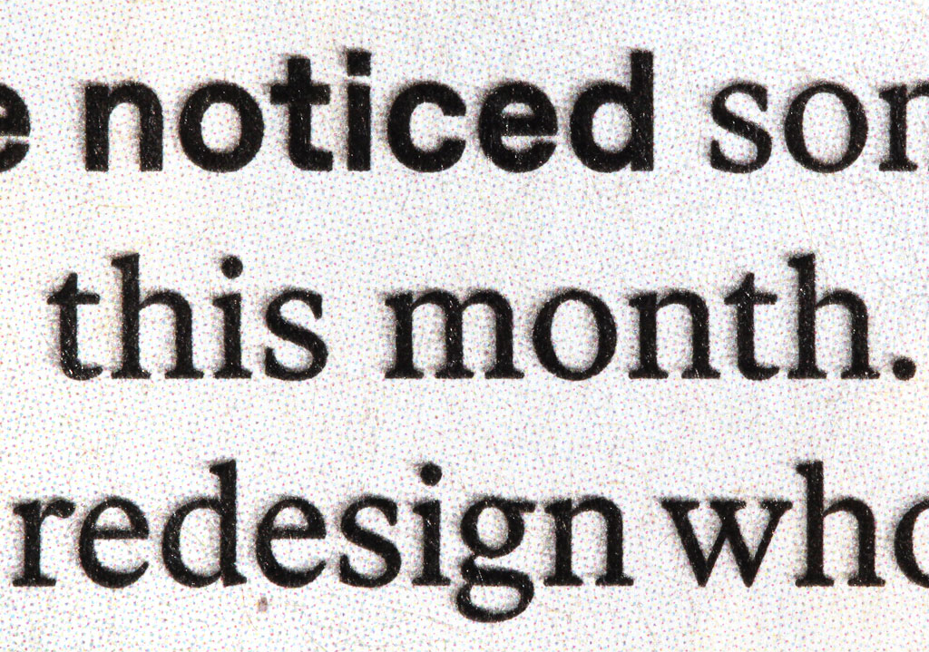
At this point it became perfectly clear to me why I was having trouble reading the text: the letters were blurred. Actually they looked like they were deliberately shadowed. But why would anybody think that shadowing a lot of text would be an improvement? And why would anybody put a shadow above the thing that supposedly caused it?! This made no sense.
After studying more of the magazine, I concluded that the "shadowing" was probably just a printing smudge, perhaps caused by a bit of paper movement during imprinting. Thankfully, that seems to have been a good guess, because while it did appear on several pages in the same issue, the ghastly shadowing never appeared again in any other issue. Whew! (I confess, I hope the designers' copies had the same flaw. It's a sort of distress that begs to be shared.)
However, another interesting feature of that page has continued to appear, and with surprisingly high frequency.
That interesting feature is the lightly half-toned background around the letters. This covers almost the entire page. In fact, on the page of the announcement, the only spot of paper not covered by this halftone is part of a QR code, whose light sections are plain white paper.
The overall effect is that the page appears to be printed on slightly gray paper.
At first I skeptically wondered if they were trying to give the impression of using recycled paper, when in fact using virgin paper plus more ink to give the gray effect.
But then I decided that no, there must be some other reason, I'm just having trouble figuring out what it is. That problem continues. I still can't figure out quite what the point is.
On some pages the background gray is used to good effect, by providing the possibility for what appear to be "brighter than white" sections in illustrations:

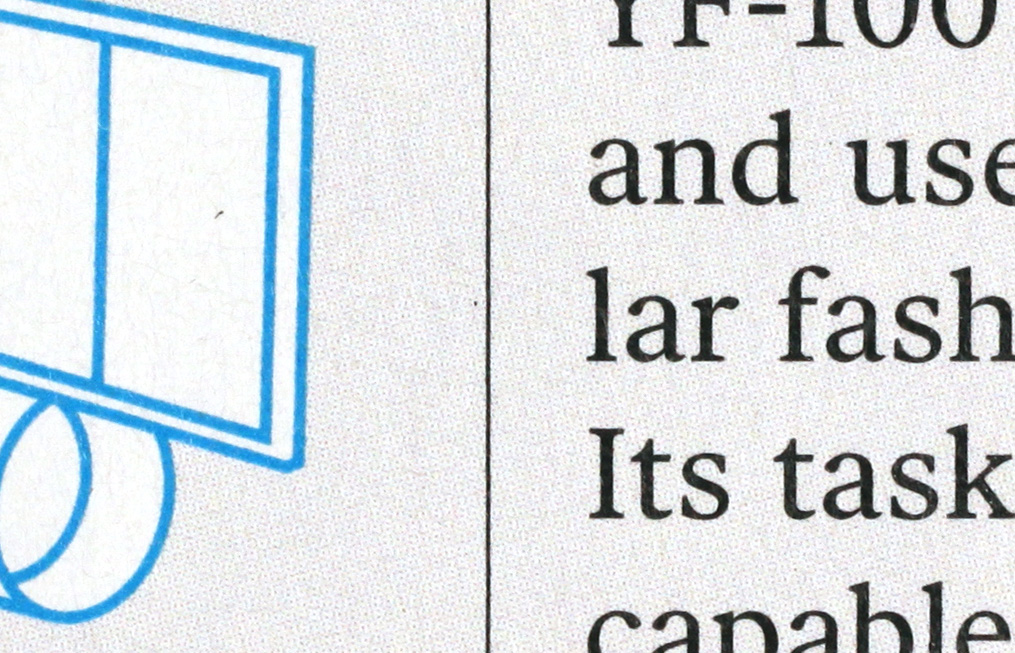
However, the brighter-than-white capability is definitely not used on all pages. Instead, there are plenty of pages that are completely halftoned, with no pure whites. And plenty of other pages with no half-toning at all, except for illustrations and sidebars. Those pages are just normal white paper. The first text page of each article seems more likely to be half-toned, but that's not foolproof either. And it's not some special sort of paper or process, because I quickly found one piece of paper whose same face is completely halftoned as "page 7" in the front of the magazine, but plain white as "page 58" in the back of the magazine, on the other side of the staples. It switches from half-toned to plain white right at the fold line, as you'd expect for any other sort of printing. I just don't know what the rule is. I'm guessing it comes from some esthetic that I don't happen to grasp.
If anyone knows why the magazine is printed like this, please share!
In any case, I hope you find this interesting.
--Rik