Stereo anaglyphs

Just bought that first macro lens? Post here to get helpful feedback and answers to any questions you might have.

Moderators: rjlittlefield, ChrisR, Chris S., Pau

ChrisR
Site Admin
Posts: 8671
Joined: Sat Mar 14, 2009 3:58 am
Location: Near London, UK

Stereo anaglyphs

Post by ChrisR »

I want to produce a set of images for a "slideshow" loop using anaglyphs.
A teacher wants "something going on" during a school open evening.
The objects won't be very small - of the order of 10 - 40mm across. They'll be electronics components, such as transducers, parts of circuit boards, or old hard drives. They'll be back-projected onto a frosted glass room divider, about 3m across.

I have about a day to do it so would appreciate hints to shorten my learning process. I won't be able to try the projections and reshoot.

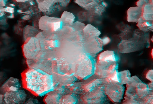
My thoughts are that I don't need high resolution as it's projected, but I'll need bold contrasty colourful images. I haven't tried taking anaglyphs before.
Will I need the image to be sharp through the depth for the anaglyph to work well, or wll it look OK if it's not all in sharp focus?

I'm thinking to use:
  • true stereo, rotating the subject 7 degrees between the two views,
    small apertures, only enough focus stacking to make the main part of the subject clear,
    relatively hard light.
I'll try Stereo Photo Maker to make the anaglyphs.

(Yes I have a box of glasses)
The screen is outlined red, the (very bright) projector is ceiling mounted just out of shot, top left.
Grotty phone pic:
Image
Last edited by ChrisR on Sat Sep 26, 2015 12:27 am, edited 1 time in total.

rjlittlefield
Site Admin
Posts: 23603
Joined: Tue Aug 01, 2006 8:34 am
Location: Richland, Washington State, USA
Contact:

Post by rjlittlefield »

Awkward situation, not being able to test & iterate.

I don't hear problems in the plan.

No, the images don't need to be sharp all the way through. But as far as you can, make sure that the same parts are sharp in both images. You won't be able to get that perfect because of the difference in viewing angles, so get as much depth as you can from stopping down rather than stacking.

--Rik

ChrisR
Site Admin
Posts: 8671
Joined: Sat Mar 14, 2009 3:58 am
Location: Near London, UK

Post by ChrisR »

Hmm. The ambient light level is bothering me. I'll make sure I have high key colourful "straight" shots too.

ChrisR
Site Admin
Posts: 8671
Joined: Sat Mar 14, 2009 3:58 am
Location: Near London, UK

Post by ChrisR »

Well it "works" though I'll have to select colours carefully.
I'm not sure my glasses correctly match the Blue or Cyan outputs - between the two perhaps. May try Photoshopping.

The LEDs are green, and red.
My dominant eye (red lens) mostly seems to "win" throughout, though the red LED flits between black and colourless.

Not so good with primary colours, perhaps.

I tried the "Half Colo" and other options - this one is "Ghost reduced".
Auto Align seems to work well :)

Image

Pau
Site Admin
Posts: 6064
Joined: Wed Jan 20, 2010 8:57 am
Location: Valencia, Spain

Post by Pau »

The image doesn't work well for me for three reasons:

- the front plane LEDs have very different tones so they don't superimpose well because they don't seem the same object. I think that it will better if you done the same monochrome conversion for both images before converting to anaglyph
- my cardboard/plastic red-cyan glasses don't elliminate completly the undesired image, more important with the red filter.
- too much displacement (I guess)
Pau

soldevilla
Posts: 684
Joined: Thu Dec 16, 2010 2:49 pm
Location: Barcelona, more or less

Post by soldevilla »

My experience with anaglyphs is not rotating the sample, but displacing the camera approx. 6 cm. the interpupillar distance. Maybe for "near" subjects, this distance must be smaller.

And I never seen a good anaglyph in colour... Is better to convert the images to B&W and add the filter colour with your picture editor. If you need, I can search a Photoshop action that I made several years ago for to convert pairs of images in anaglyphs.

Image

ChrisR
Site Admin
Posts: 8671
Joined: Sat Mar 14, 2009 3:58 am
Location: Near London, UK

Post by ChrisR »

Thanks. "Gray Anaglyph" is indeed one of the options and it does look better.
You can also play with the contrast, brightness and gamma for each image.

Image

Post Reply Previous topicNext topic