Firstly I have to say a massive thanks to those of you that have been talking to me quite a bit recently. Since joining this forum I have entered onto a learning curve so steep that it almost satisfies my obsessive personality. At the moment my rig is a little sloppy, I don't have a good positioning solution and I am using a reversed 50mm prime lens mounted on bellows. I have a El-Nikkor 50mm f/2.8 in the post however so hopefully as I pick up more bits of gear / technique I can improve from here.
Seems to me that you've climbed that learning curve pretty quickly!
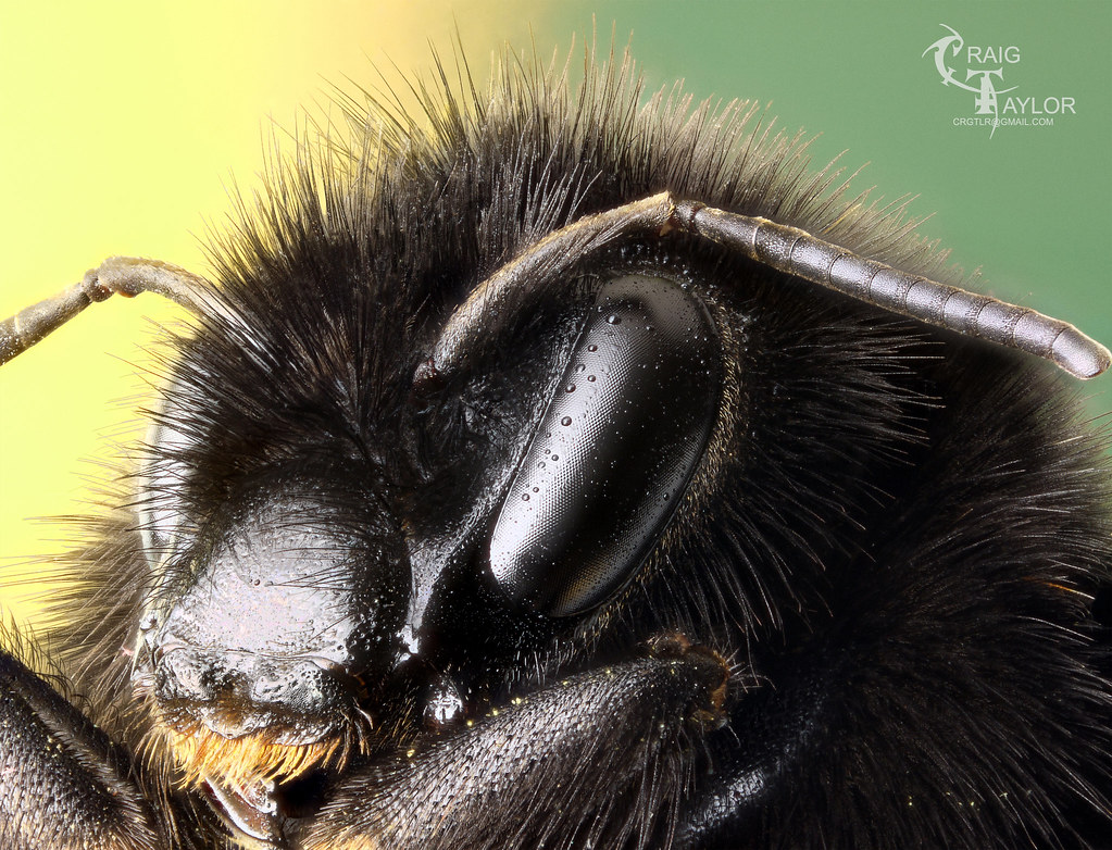
This image is excellent. Good choice of aperture and a solid procedure for choosing it. Lens is sharp enough to have captured the fine feathered hairs on the forehead and front leg. No trace of CA. No "transparent foreground" stacking flaws. Good capture of detail and iridescence on the shiny cuticle above the mouth. Smooth gradation, no excess noise. Interesting pose.
The only things I wonder about are rooted in personal aesthetics. The lighting seems a bit too contrasty for my taste. I get the feeling that direct reflections from the eyes and mandibles are blown out. On the other hand, I'm not sure they really are. Close inspection of the pixel values on the mandibles shows mostly 240-245, not the 255 of a truly blown pixel. Sometimes brightly lit shiny black stuff looks blown out no matter what you do, and maybe that's the case here. The yellow background is completely saturated in green, and the transition from yellow to green through orange makes me wonder what sort of background you used.
At flickr, there's a typo in one post: the blurring effect you've read about is "diffraction", not "refraction".
I hope this helps, though it seems to me that you don't need much at this point.
--Rik
PS. At flickr, thanks for the kind words about photomacrography.net!
Thanks for the kind words Rik. I just recieved the El-Nikkor 50mm f/2.8. It's in absolutely perfect condition and I can't wait to try it out, hopefully this weekend.
The lighting is too contrasty I would agree. I have tried about 700 (not literally) different diffusors, angles, distances etc etc. Chris S has given me some good lighting advice so hopefully I can apply that to my next image.
The background was the cover off a VHS, it was already on the desk when I set the bee up and I thought it looked alright. It was clearly a bad choice though, the bit at the very top of the image in the middle is definately the part that grates on me the most. Any advice / links on backgrounds would be wondefull. I'll have a dig around on the forum later, I'm sure there must be something on here.
I have updated the typo, thanks for pointing it out. I have been talking to a friend about refraction in water droplets quite a bit recently so it's on the brain.
Looking for a new subject now too, I don't really like killing things too much so hopefully I can find a colourful bug that has had a heart attack. There aren't really many flies around at the moment, but the moths are starting to appear.
The best advice I can give is not to start with a bumble bee, the difference between bits of shiny face and their hairy bits which are effectively excellent flocking material is extremely difficult to get right. I don't think you did a bad job at all here...
Cheers Laurie. A thing that did get annoying, was that any white spec on the bee was rendered as bright white by the lens I'm using. I think this tricked serene into thinking those bits were sharp in focus areas. I'm looking around for a new subject. Maybe a fly or something.
I have no experience with stacking images so I'm always intrigued with the results. I don't think the lighting is too harsh. There are no totally blown-out highlights and I think the pattern of the bright areas helps pull the eye into the important areas of the image. I sometimes think that we go too far to flatten the lighting in an image resulting in images that have no depth or "sparkle". I, personally, like this image as presented.
Tom Webster
Phoenix "The Valley of the Sun", Arizona, USA
The worst day photographing dragonflies is better than the best day working!